
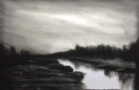
This is an invented landscape based on the charcoal sketch shown below. I wanted to paint something with a warm landscape and a cold, gray sky. In the end, the painting is a bit higher key than I imagined, but I am quite happy with it.
I have been working on my self, trying to watch and keep in check the tendency to draw conclusions – conclusions about meanings, situations, where things are headed, etc.
I have found that 90% of the time, my conclusions are influenced more by my physiology at the time than by the actual facts at hand. Just let those thoughts churn all the way through – don’t conclude, don’t conclude. Things look different in the morning light.
Rilke wrote:
Moving Forward
The deep parts of my life pour onward,
as if the river shores were opening out.
It seems that things are more like me now,
that I can see farther into paintings.
I feel closer to what language can't reach.
With my senses, as with birds, I climb
into the windy heaven, out of the oak,
and in the ponds broken off from the sky
my feeling sinks, as if standing on fishes.

Rainer Maria Rilke, tr. Robert Bly, in
Selected Poems of Rainer Maria Rilke
Thanks for visiting my blog.

Have you got/read The Artist’s Way by Julia Cameron? I think you would really like it.
LikeLiked by 1 person
Yes, I have it, it is on my bedside bookcase. I have not read it for some time and was just thinking of working through it again. Synchronicity!
LikeLiked by 2 people
I love the reds in this. How are the colors in real life? I know you had mentioned the sky was different than the photograph in another painting you posted for us. I am always curious about photo effects on colors.
LikeLiked by 1 person
Ps
The sky is lovely.
LikeLiked by 1 person
Thanks!
LikeLiked by 1 person
Thanks DawnMarie. I have no idea what the colors are like in real life – I made everything up! All I knew was I wanted a warm, autumny foreground to warm up that cold sky, so this is what came out.
LikeLiked by 1 person
Not real life as in real life. I meant on your painting. I don’t do things from real life either, but sometimes my photo of my finished painting does not match what is actually on the canvas. My turquoise will photograph as plain ol blue for instance and it ticks me off! So is that red on the orange side and kinda rusty or is it deep dark red. That might be a better way to phrase it. Real life…meh. I paint to get away from real life. Hehe.
LikeLiked by 1 person
Sorry DawnMarie, that is daft of me. I see now what you mean. In this case the color came out quite true to the real thing. The only thing I can say is that I noted that with the pastel the blue tends to come out lighter and stand out a bit more than if I view it with the eye. But the red (burnt sienna, actually) is quite close to the real thing, to my eye.
Fully agree real life…meh 🙂
LikeLiked by 1 person
Giggle. How daft….have not heard that word in a while. Preposterous!! Farsical!!! (Looked up definition so I could poke fun…such a fun word!). I think I might incorporate it into my vocabulary and see if it sticks. My husband should get a kick out of it.
Thank you for the color information!
LikeLiked by 1 person
Yes, I have to say I easily laugh at myself when I realize I was/am “daft” – feels a bit different/funnier than some of the other descriptions I have given myself!
LikeLiked by 1 person
Meh…I love that word too. Cracks me up when I see it n writing. Meh meh meh.
LikeLiked by 1 person
Great that you can laugh easily Dawn – it will help you grow up without growing old!
LikeLiked by 1 person
Daft, meh. Just practicing my vocabulary.
LikeLike
It feels like your painting is trying to say something…..barely audible 🙂 Your paintings have such depth that you don’t see everyday, I admire this so much. I agree, often what we think is what we think our reality is. I am always intrigued by the thinking process and how it relates to our imagination and how far we often take it, sometimes to a negative area.
LikeLiked by 2 people
Thanks so much for your kind words Margaret. I am also quite fond of this painting.
LikeLiked by 1 person