
I started this painting over the weekend.
In this painting I tried to expand my skill set and experience in three ways:
- Trying something much larger than normal;
- See if I can master grading a yellow colour from light to very dark;
- Experiment with an abstract painting without any clearly defined lines or shapes;
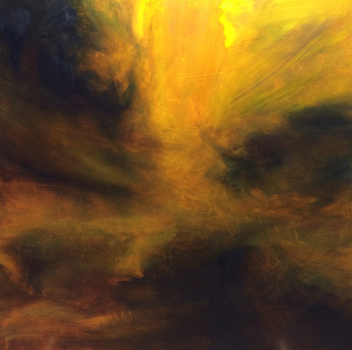
The painting was coming along nicely until an ambivalent and slightly irritated attitude in one single session spoiled it. It is doomed to be cut up and recycled. I am disappointed but I moved on. Here is what I learned:
- I have not yet mastered how to paint in oil directly over an acrylic gesso. In one place, at the top toward the upper right corner the imprimatura came clean off and left a bright spot that I cannot seem to cover whatever I do. For now, I am resorting to mounting canvas on board – it seems to suit me better;
- Be very careful of white! Like the brilliant teacher Mark Carder shows in this video, once white gets into the mix it pollutes everything. Watch the video – it can save you from lots of frustration! You can see this with the opaque, garish yellow coming in from the top right – before I put white in there, the painting glowed with translucent golden yellow (Indian Yellow – currently my favourite colour)
- Paint darks thinly (I knew this but did the opposite anyway!). With my bad attitude I just dabbed on thick patches of blue into the dark areas – up to that point rich and deep. The result is several dead, matt patches that look off. You can see this in the upper left corner and other places.
Looking at this now, I am not 100% convinced it is doomed. I may leave it around for a week or two and see if I feel like re-working it.
While painting this I listened to Zbigniew Preisner’s “Lacrimosa” and in my mind played the scene from the movie The Tree of Life. If you have not seen this – take three minutes and watch this clip, you may like it.
The universe is stupendously mysterious in its combination of extreme violence, utter serenity and beauty. Pushing deep into the heart of a painting while working is perhaps one way to explain this to myself, albeit without words.
In the great book The Universe Story, I looked up this paragraph:
…we now know that the interiority of any mammal, for instance, that which corresponds to parental care, is the result of a long and complex process of creativity beginning with the star-making powers of the Milky Way. Walt Whitman did not invent his sentience, nor was he wholly responsible for the form of feelings he experienced. Rather, his sentience is an intricate creation of the Milky Way, and his feelings are an evocation involving thunderstorms, sunlight, grass, history, and death. Walt Whitman is a space the Milky Way fashioned to feel its own grandeur.
I always hesitate to post my own poems – I am a rank amateur at poetry and couldn’t care less about punctuation and meter. But I felt this poem was fitting, since it deals with another universe in which I play a role – my compost heap:
Toward the Light
When the black bin was half full
with limp salad, rotten bananas
and orange peelingsI filled it with a layer of
dark loamy compost.
Its dark was a tapestry of things that were alive.And the worms floated down
into the dark below
– moving cautiously into a new continent.And in their cells – who can say not –
there was the same gladness
of a child running with a kite.
His face turned for a moment toward the light.
Thanks for visiting. I hope you are happy and content in this day.

I really enjoyed your poem, who can say not!? I love the whimsicalality of it! And although your painting is not how you envisioned it, I like it! It looks like light to me and that very light patch that you despair for me makes it! 😂
LikeLiked by 1 person
Thanks so much for your kind comment, I really appreciate you taking a moment to pause, read and repond. I may save that painting yet!
LikeLiked by 1 person
I hope you do! 😊
LikeLiked by 1 person
I love the drama of this painting, it looks like an apocalyptic sky breaking overhead, it’s awesome!
LikeLiked by 1 person
Many thanks!
LikeLike
wow! I said, Holy hannah, thats awesome! to myself just now 🙂
for me, this sky is magnificent in its power and depth.
LikeLiked by 1 person
Debi, I really cracked up laughing at the way you put your comment. “Holy hannah”. Thanks so much for your encouragement.
LikeLiked by 1 person
you are so welcome!
and, i am smiling now that i made you laugh!!! 🙂 you can tell i speak fluent slang from 2 countries….. cheers mate, Debi
LikeLike
I really like the colors in this painting, the graduating yellows. Also like the composition. Very stormy. If you don’t rework it, at least you have another skill you can carry over to something else.
LikeLiked by 1 person
Many thanks DawnMarie! I am reconsidering this painting every day – may work on it some rainy Saturday afternoon and get it to be what I think it can be!
LikeLiked by 1 person
Beware of white! So true. I have a few paintings where I contaminated and the darks look chalky. Annoying!
LikeLiked by 1 person
I was very puzzled by your comment regarding white. I have never encountered this idea before. I use a ton of white, and as you know manufacturers put white in larger tubes precisely because it gets used up faster than the other pigments. So this was really a mystery for me.
Looking at the video, I am still a bit flummoxed. In the context of his method — the Carder method — introducing not only white but anything that doesn’t conform to the pre-established plan of a specific picture is going to throw it off. In his method, the tonality is all worked out from the start and obviously therefore depends upon a stable light source. A plein air painter cannot use his method without significant adjustment since the light source can be much more complex depending upon your motif, whether you’re in the shade or in full light, which direction you’re facing relative to the light, etc. The sun’s gonna move! Thanks what it does.
And a still life painter who approaches still life as if it were plein air — which is what I do a lot of the time — can’t use any of his method either. It’s not responsive enough. It’s too planned out. The painting is not “reality” but is an illusion — hopefully a persuasive illusion — of some sort.
Claude Monet would have no idea what Carder is talking about. White is mixed into almost all the colors in the Impressionist palette, either a lot or a little because in bright light you have a lot of light color everywhere. White is, after all, the full spectrum (of visible light to humans). Ir’s complicated.
So just sayin’. Carder’s commentary needs to be understood relative to his system. I couldn’t paint taking the advice he gives. I use white all the time, in areas of shadow as well as in middle tones, high lights, etc. It’s the control of the amount of pigment in specific mixtures that creates the effect. Any pigment. Over time you learn to put this and this together to get “that.” There can be several ways to make the same color. And color techniques vary widely according to stylistic features.
Carder’s method can be a good way to understand one aspect of color, particularly a sort of “photographic” approach to painting — an adapted photographic approach. Note that photographs can be colored using just three ink colors plus black leaving spaces between dots to allow the white of the paper to show. It’s all done on such a small scale that you eye cannot detect it. You have to look at the photograph under magnification to see how the colors are separated. He’s using a similar process — something like a very refined paint-by-numbers approach — to get at a similar result.
But his method is a straight-jacket too. There’s whole huge avenues and boulevards as well as little foot paths in art that cannot be reached if one were to adhere strictly to his method.
Now, regarding darks. Some dark pigments in oil paint get dry looking after the paint is dry to the touch. You can eliminate that look by applying varnish once everything is thoroughly dry (after 6 months or more has passed). It’s not that the artist did anything wrong. It’s a chemical effect. Every pigment is different chemically and they each kind of do their own thing.
To see what varnish does optimally, take a picture — you can use any picture. A photograph, a magazine illustration will do. Put half the picture under a sheet of glass. Allow the other half to sit there uncovered. You should be able to notice a tonal difference. The glass alone will make the colors seem a slight bit darker. This is why watercolor looks less dark when the water evaporates. The varnish of an oil painting restores some of the rich appearance of certain dark pigments. Oil paint is always darker than pure pigment applications for this reason, because the layer of oil acts like the piece of glass. Adding varnish lays yet another layer that light travels into and out of and hence makes it appear a little darker still.
LikeLiked by 1 person
gotta proof read on these long comments thanks=that’s; you=your and optimally=optically [that’s what the sun does/your eye cannot detect it/to see what varnish does optically
unless they were Freudian slips!
LikeLike
Just call me long comment girl!
LikeLike
Phew, that said. Count me in with the others. I think your picture looks very dramatic. The bright yellow doesn’t bother me. If something happened to the ground (the gesso) maybe you cannot adjust that yellow further. Is hard to address that issue seeing it in reproduction. But that has nothing to do with using white as a color.
Looks really moody and interesting. Live with it a while, there’s always time to chuck things later if you decide that it must happen.
And I love your poem! It is very expressive. You think about things in a deep way.
LikeLiked by 1 person
Hi Aletha! Lots of food for thought in your comment! I will not respond extensively because, to be honest, I do not have the depth of experience to have a solid opinion on some of the points you raised. But it is useful to reflect on and I hope others will find the same in your comment. Two things I will say:
1. I have learned a lot from Mark Carder’s videos and I find his humble, steady but intense way of talking and teaching quite nice. However, I completely understand what you say about the limitations of his method for some people. I for one knew, even as I was learning from his videos, that I would never, ever be able to paint in such a structured, systematic way. But as Edwin Dickinson said: “There is room in this world for everyone under the sun”.
2. About white – I really have lots more to learn before I can really put a strong opinion forth, but when it comes to oil painting – at the risk of sounding like Oprah – this I know for sure: (a) if I mix white into a color it tones down the intensity, no matter what. Carol Maine also has a brief note about this in her book; (b) when white gets into a color, the color becomes more opaque and also cooler. This may be a desired effect in still life painting and some impasto abstracts, where walls and flat surfaces are represented in paint. Matt, flat spots are sometimes the highlights in some of the abstracts I have seen and liked; (c) related to a above – when there is some white on your brush, it should be cleaned off, or even switch brushes, if you are intending to mix a deep, dark, transparent colour. In my experience, this is not so necessary if you have a more transparent colour on your brush.
Having said that, I do like the color white! Perhaps even to the extent that Andew Wyeth did when he said “Oh, I love white. Marvelous. It excites my imagination”, plenty of examples in his paintings, like here: http://www.christies.com/lotfinder/drawings-watercolors/andrew-wyeth-deserted-light-5073586-details.aspx (there is one focusing on Chalk Cliffs that I like best – but could not find it now).
Thanks again for your comments and compliments, I appreciate your encouragement!
LikeLike
Fine work Fritz.
I think you have done a fine and dramatic painting and a grea celebratory poem for the compost.
We are fans of Brian Swimme and his work and approach to life as well, so fine philosophy also.
Completely cosmic Fritz.
Well done.
Cheers,
Frank
LikeLiked by 1 person
Much appreciated Frank, thanks very much!
LikeLiked by 1 person