
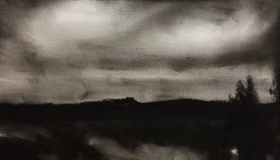
This pastel was roughly based on the charcoal sky study of an earlier post (image shown again below). I started with a watercolor under-painting and then covered this with pastel. My pastel set is still too small – I am missing some crucial light oranges and ochres that I would normally use in the sky and water reflections. You can see the color of the reflections in the water is not quite right and a bit overworked. In the end the paper could take no more.
Lots to learn, and miles to go before I sleep.
I have had a rewarding but tiring week at work, no time for anything creative apart from the odd sketch in a stolen moment. I feel tired and my back pain is driving me nuts. I keep the voices at bay while the year hurtles toward the final quarter – time becomes viscous and energy dissipated. A harder time is coming…
The Respite
A harder time is coming.
The end of the respite allowed us
appears on the skyline.
Soon you must tie your shoe-lace
and drive back the dogs to the marshland farms.
For the fishes' entrails
have grown cold in the wind.
Poorly the light of the lupins burns.
Your gaze gropes in the fog:
the end of the respite allowed us
appears on the skyline.

(first verse of 3)
Ingeborg Bachmann, translated by Michael Hamburger
in Modern European Poetry, ed. Willis Barnstone
Thank you for visiting my blog. I hope you find strength, courage, joy and contentment in the week ahead.

Perhaps you’ll be building up your color selection? are you going to be sticking with pastels? You seem to be able to get by with a limited number from what you have been producing, a wonderful showing of paintings. You might have the “pastel touch” after all.
LikeLiked by 1 person
Yes, I will build up my selection, but it is not straightforward! Too many choices! I need a free Saturday and a replenished budget to pick a solid set of about 30 colors. That opportunity has not come along yet! Many thnaks for your encouragement!
LikeLiked by 1 person
Well, obviously the reflection is of fire in the sky. I would expect it to be bright. Don’t be so hard on yourself.
LikeLiked by 1 person
Keep on keeping on, you’re doing grand. 🙂
LikeLiked by 1 person
Hi, looks great to me too. 2 questions!! Does the colour in the water have to be “right”? If yes (I would say no), then can the sky be made “right”? 🙂 A parallel reality of the same intensity. Love the dreamy quality of what you do with pastels, keep it up!
LikeLiked by 1 person
Many thanks Alaistair! Indeed, I am battling so hard to slowly peel myself away from the confines of what looks ‘right’ and get to express just what is ‘felt’ instead. A lifetime’s journey.
LikeLike
Thanks FR!
LikeLiked by 1 person